
Case Study 03
TCO Services
Making a licensed, family-run renovation company read like the most established name in the county.
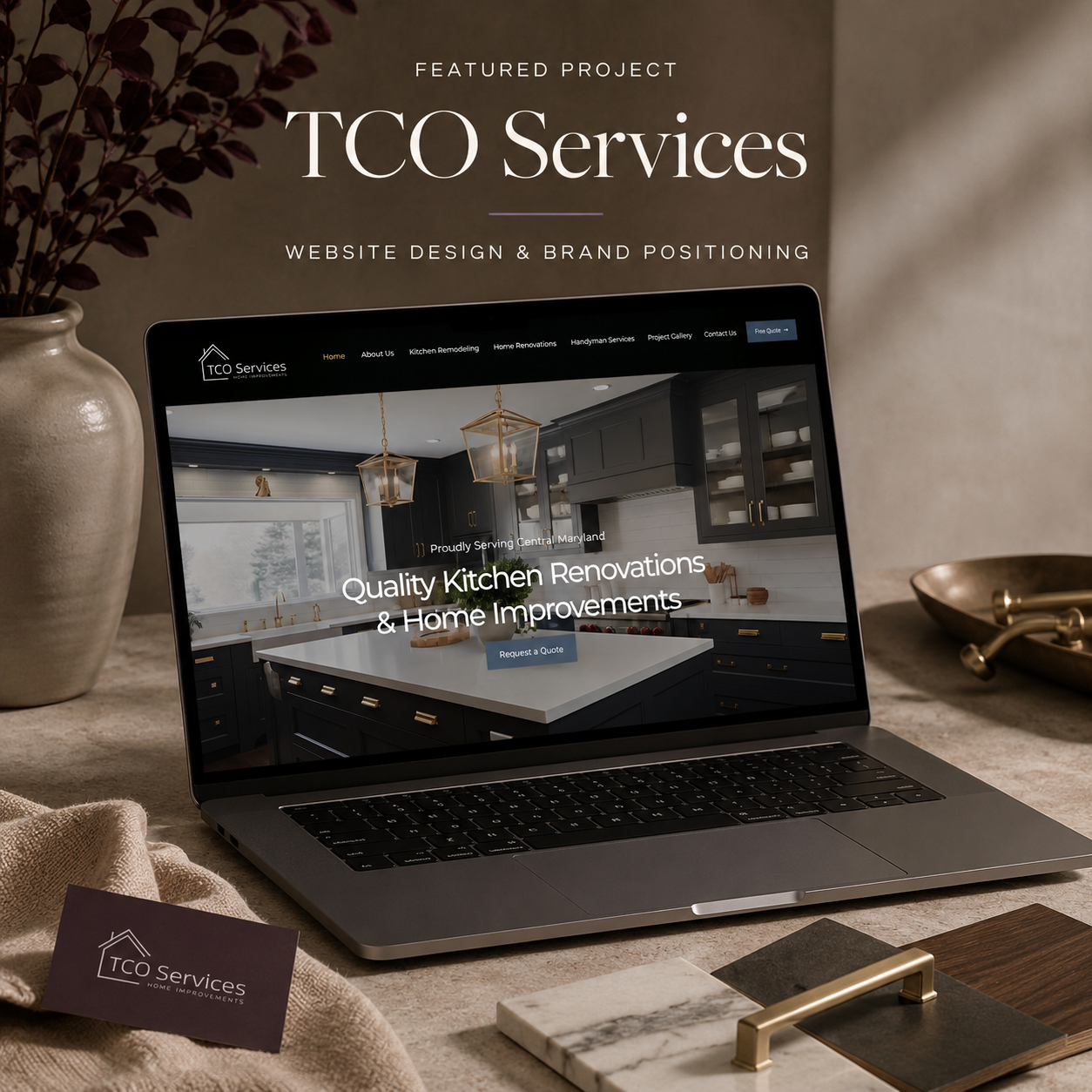
The Challenge
TCO does beautiful kitchen work, but homeowners searching kitchen remodeling near me were meeting national lead-generation sites and big-box showrooms first. The craftsmanship was already there. The signal that said these people are licensed, organized, and will show up on Tuesday was not.
What I Built
A positioning line to build everything on — A better way to renovate — and then a site that proves it. Three distinct service paths so kitchen remodeling, home renovations and handyman work each own a page and a search intent. A real project gallery instead of stock kitchens. The counties named out loud. A quote request never more than one scroll away. And the owner forward, by name, because in the trades people hire a person, not a company.
Why It Works
Homeowners are not shopping for design — they are shopping for reassurance. Warm neutrals, brass and stone, clean typography and a lot of white space read as organized, which is exactly the promise the business is making. Every page ends with the one thing a homeowner is actually ready to do next: ask for a number.
A site that looks established, speaks to the counties where the work is, and turns local searches into quote requests.
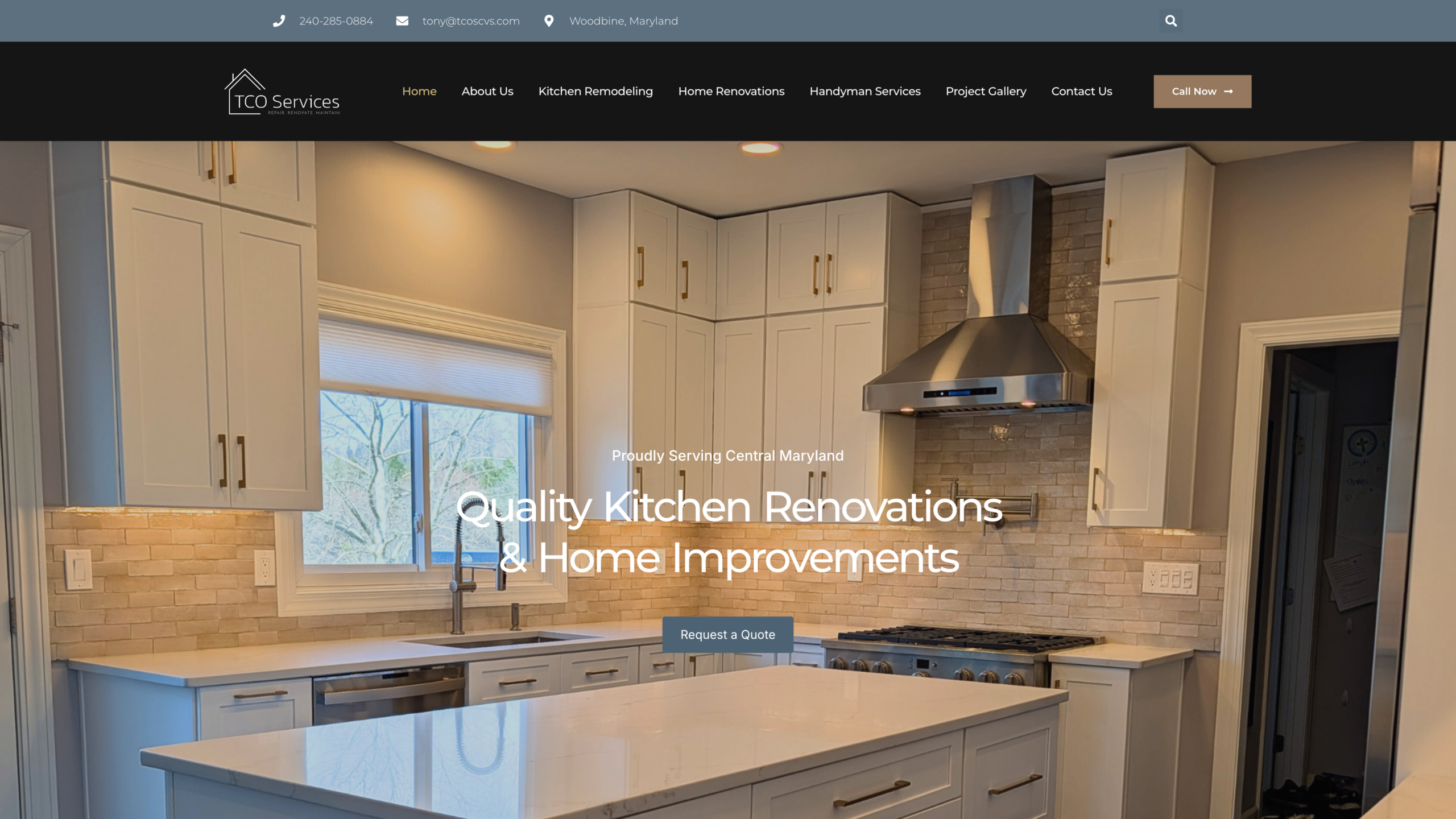
Homepage — quote request in reach
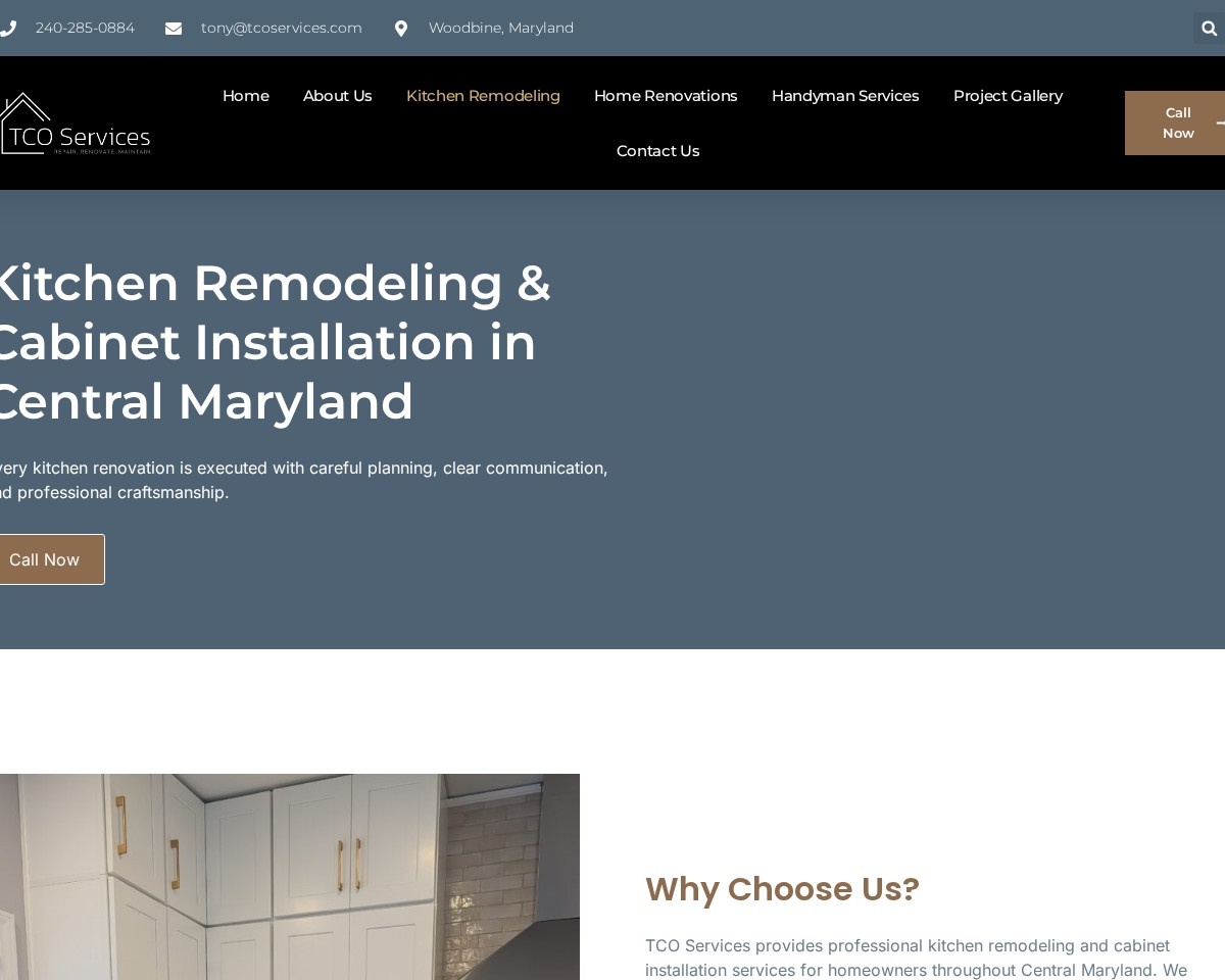
Kitchen remodeling — one page, one intent
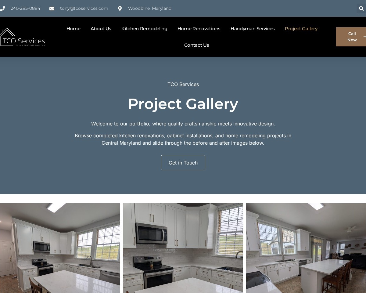
Project gallery — real work, not stock
Continuity
The website had to match what was already in the driveway.
TCO already had a mark, a black and a steel blue — on the truck, on the cards, on the crew. Most contractor websites ignore all of that and start over. This one was built out of it.
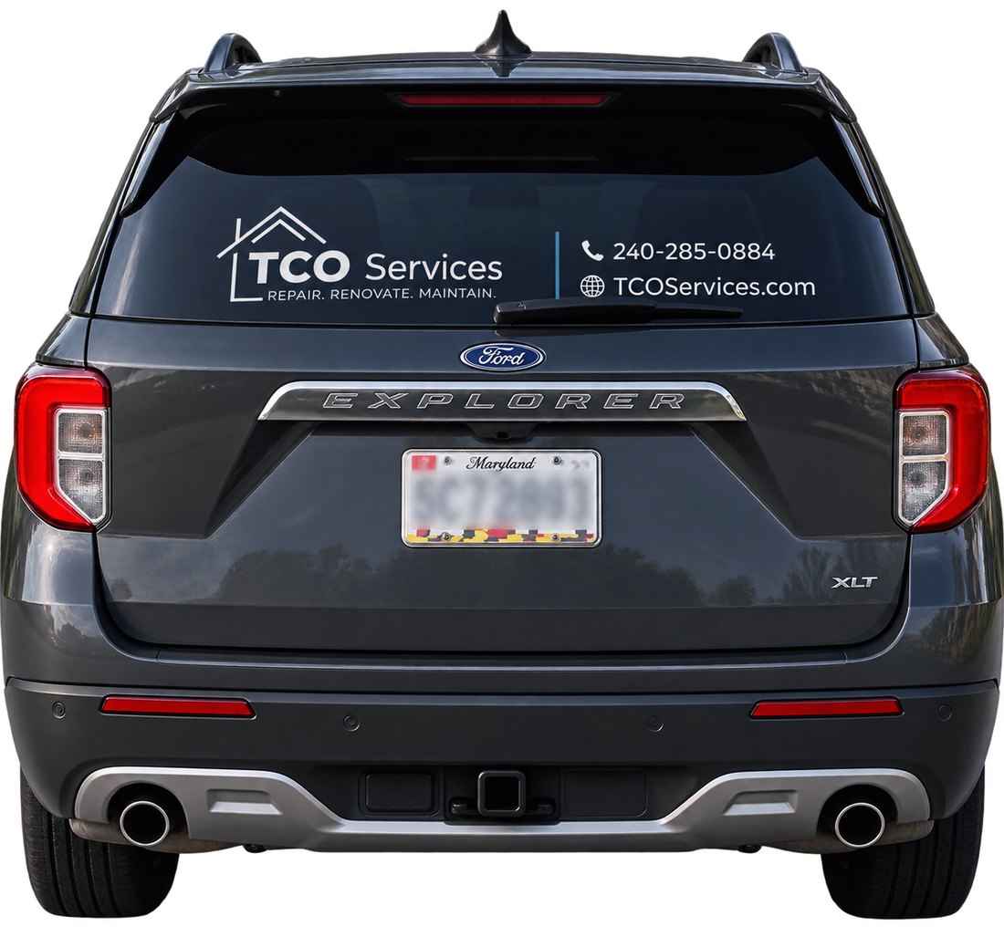
VehicleRear-window vinyl: logo, number, address. For most people in Carroll and Howard County, this is the first version of the brand they ever see — usually parked in a neighbor's driveway.
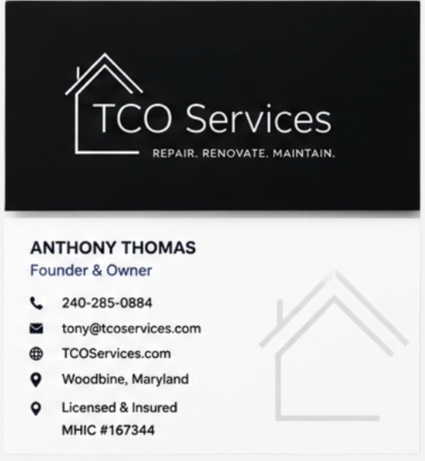
CardLicensed, insured, and the MHIC number on the back where a homeowner looks for it.
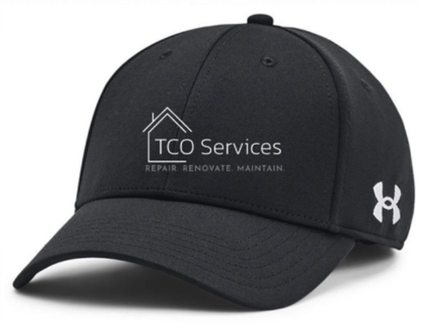
CapThe mark reversed out in white, one color, small — the hardest test any logo has to pass.
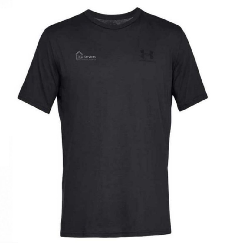
CrewWhat the customer sees for three weeks straight while the kitchen is torn out.
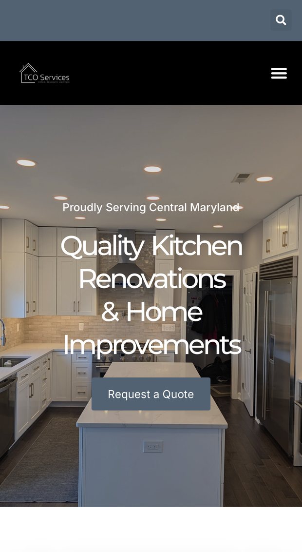
WebsiteSame black, same blue, same mark — on the device most of these searches actually happen on.
A homeowner who meets the truck on Monday and the website on Tuesday should see the same company twice.
That sounds obvious. It almost never happens. The truck gets lettered by a sign shop, the shirts come from a promo catalog, and the website gets built by someone who never saw either — which is how a good company ends up looking like three different ones. The work here was mostly refusing to start over.